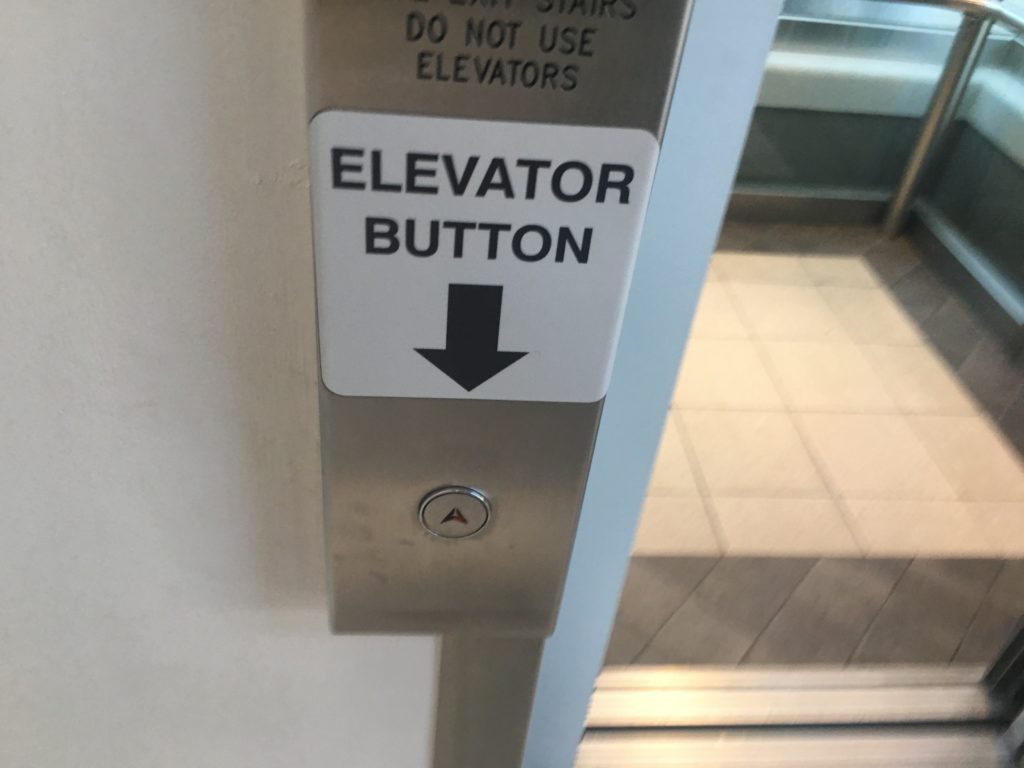
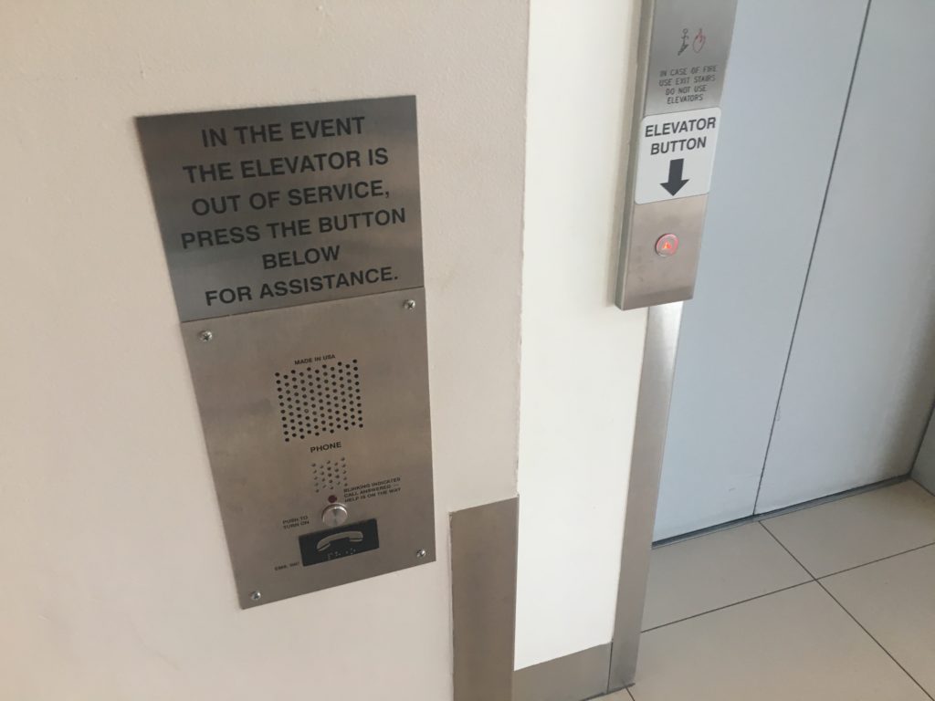
The wacky world of signage is as varied and unusual as the many situations that require a sign. This one, though, struck me as quite a rare situation: depending on your angle of approach, the sign was either utterly superfluous – or totally necessary.

The location: Vancouver’s Oakridge Mall, near the main entrance at Cambie and West 41st. The sign: “Elevator Button” – pointing out what would seem to be the plain-as-dirt fact that the button in question is, indeed, for the elevator. What the heck?
My bafflement faded when I looked around and saw… the other sign next to the other button.

Thought #1: This elevator breaks down so often they need a big “help” button right next to it?
Thought #2: They made the emergency intercom button look exactly like the elevator call button?
Thought #3: …and they put it right next to the elevator?
This does nicely show off a principle of signage that I love: no sign exists without a situation which has made it necessary. Note how many signs admonish people not to do something, which can only mean that they’ve been doing just that and someone wants them to please cut it out, already. It’s probably extremely rare for a sign to be placed pre-emptively, to try and prevent something people might do.
In this case, clearly the intercom button was being pressed all the time, needlessly summoning, or at least disturbing, the mall cops, police, or God knows who. The other sign came later.
It’s an awkward situation at best, and could have been more elegantly solved any number of ways – but it would’ve had to be thought through in the planning stage. I can think of a few:
- Put a bold sign labeled “Help Call” or “Assistance” right next to the intercom button.
- Even better, put a phone icon right ON the intercom button. Hard to miss that, plus it’s clear in any language.
- Don’t make the intercom button look so much like the elevator call button – make it square, larger, a different colour – or all three.
- Do all of the above.
But since they didn’t do any of them, we get a (surely ineffective) “band aid” solution on the real elevator button. And probably still a lot of false-alarm calls to security.
Because nobody really reads signs. It’s better design, thought through from the ground up, that leads to better interactions, not “read this please” notices tacked on in the hopes that they’ll be seen.

0 Comments