
Blog

How a stopped clock can taint your brand
Before you decide to include a clock on your business's sign, think twice. This is much more than merely a design decision. It's a commitment to ongoing maintenance of a sometimes-finicky mechanical device that needs to remain functional — or risk tainting your brand....
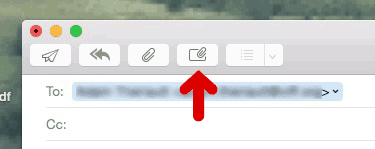
Apple Mail tip: clear the clutter from replies by clicking the "mystery button"
Use this easily-missed (I did until recently!) button in Apple Mail to make your replies less bloated and more recipient-friendly.
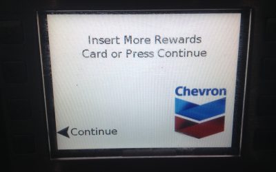
Chevron followed my advice!
I accept that Chevron may not have been responding directly to my blog post last spring. But my criticism was clearly on target, as the screen layout issue I grumbled about is now fixed!

You'll be surprised at just how many steps there are to this "simple" Adobe update
There are things we’re compelled to do all the time on our Macs that are far more complicated than they need to be. It’s easy to forget this fact while cruising on autopilot through a tedious yet familiar series of mouse clicks. Unfortunately, Adobe seems to have forgotten it too – to the detriment of their users.

The mysterious Freshii "star system"
Despite the best of design intentions, I found one element of the Freshii menu to be a little baffling. Could it all be Dr. Seuss’ fault?

21 nifty iOS features you probably didn't know about
When I finally hunkered down and went through the iOS User Guide, I was surprised to learn quite a few nifty new things about iOS and my iPod Touch. Here’s 21 of the best!

Password snafus EVOke frustration in BCAA's new car-sharing site
I almost got stranded at the on-ramp while trying to sign up for the new car-sharing service from BCAA. Here’s what the user-interface flaw was, and how I sorted things out.

Visibility goof in new Chevron screens leaves tall users a little short of information
How a major corporation let basic design and visibility rules fall through the cracks.