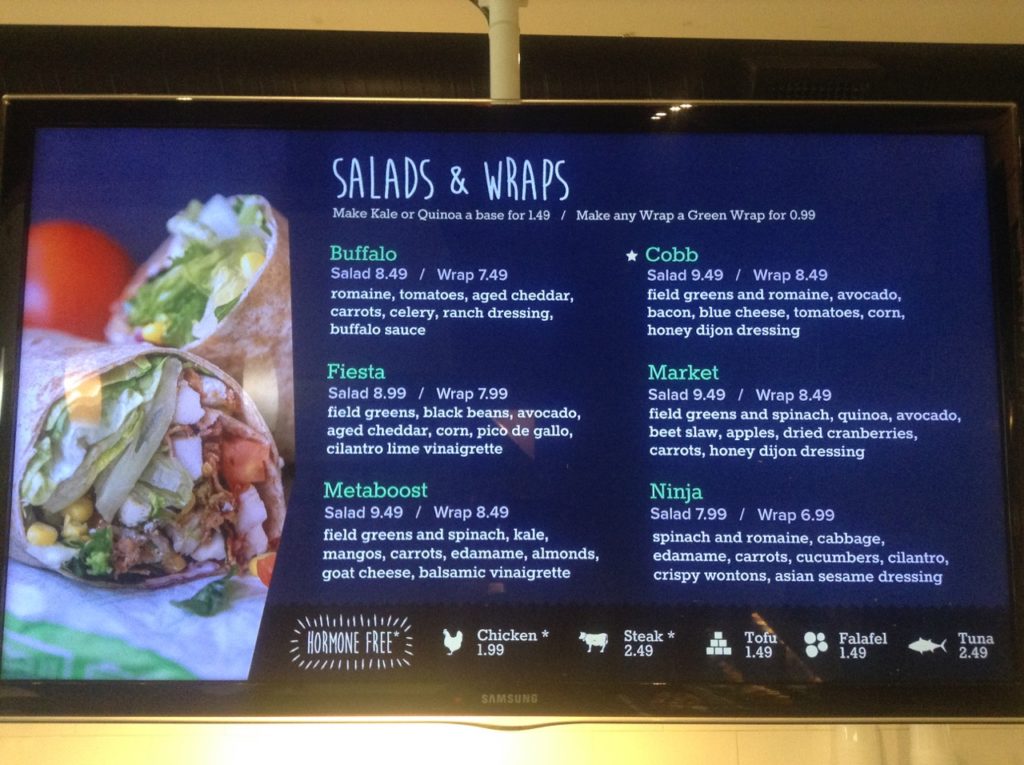
I’d been meaning to pop into a local healthy-looking lunch place called Freshii for ages, and when I finally did, I was impressed – not only with their delicious and healthy food, but also with their sophisticated store and menu design. Turns out that they’re a massive global chain, bringing good healthy on-the-go food to the masses from Sweden to Saudi Arabia (plus the three local Vancouver outlets).
But their menu board was proof to me that communication design is always challenging, and doing even a very small thing differently can lead to confusion instead of clarity.
Or maybe it’s just me. You be the judge.
Perusing the menu, displayed on wide Samsung LED screens, I noticed that one item had a star next to it. What, I thought to myself, is that star for? It just didn’t seem at all obvious.
The photo doesn’t really capture this, but that star icon is the exact same light-tan colour as the icons at the bottom of the screen, leading me to believe that it related to them somehow. But of course, among the little chicken, cow and tofu cubes, there isn’t a star. Maybe it’s because I was hungry so my brain was at a disadvantage, but I was baffled.
Then I looked again, and the star had moved!
What gave?
It turned out that the star appears next to the menu item currently pictured in the photo on the side of the menu.
Those images change every little while. But unless you’re watching at the exact time it changes, the star connection is pretty non-obvious. During the image transition, the star moves to the appropriate item.
Even the colour choice helps to throw the viewer off the scent. In a layout that uses colour very distinctively, with turquoise, purple and white text, it seems a mistake to make that star the exact same pale-brown colour as the icons at the bottom; it implies a connection that’s not actually there.
I applaud what must have seemed like an elegant and less-is-more solution to identifying the item pictured. But this is probably too subtle. It violates the ““Don’t Make Me Think” rule set out by Steve Krug in his great book of the same name. A simple caption is probably the way to go here – it’s instantly understood, vs. the milliseconds or longer it takes to suss out the “star system”.
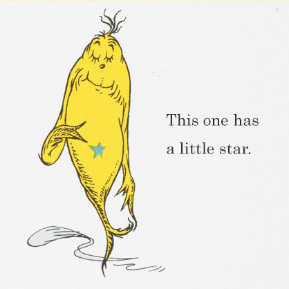
Of course, the designers may merely have been unduly influenced by Dr. Seuss’s “One Fish, Two Fish”. The “little star” is even a pretty close match for the turquoise of the menu item names!


0 Comments