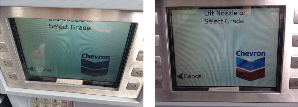
While at the gas pump the other day, I was diverted from my usual musings on the high price of gas by a glaring example of how design and communication are intertwined… and how even a huge corporation can make a seemingly obvious mistake.
Chevron appears to be rolling out a new design for the screens on their in-pump monitors. Perhaps this is tied to an upgrade on the back end, I don’t know. But there’s a problem… at least for taller customers.
The main text is placed at the very top of the tiny screen – almost touching the top of the usable display area.
Now, this is awkward-looking in the extreme – there’s lots of (unused) available white space to place the message in. But that’s not the biggest problem. At certain heights – like mine! – this placement ensures that some or all of the text disappears out of sight. You have to hunch down to see the first line of text at all. If it’s a one-line message, it’s gone.
Surprising that something like this would be missed in a major tech rollout, but it just goes to show – design is important, as is the context in which your message will be viewed. And in some cases, bad layout can completely obliterate your message!
Update: I emailed a summary of this situation to Chevron’s “Consumer Connection Centre” and they responded that they would pass it along. We’ll see what happens…


0 Comments